This revelation began when in week 2 when we watched the helvetica documentary which I found very interesting. I didn't realize that helvetica was everywhere!


Helvetica is such a timeless font, its simplistic and is standing the test of time. You cant go wrong with Helvetica.
As I learnt more about helvetica and its significance it made me think about other typefaces and their importance.
When I was choosing my typeface I wanted it to really stand out.
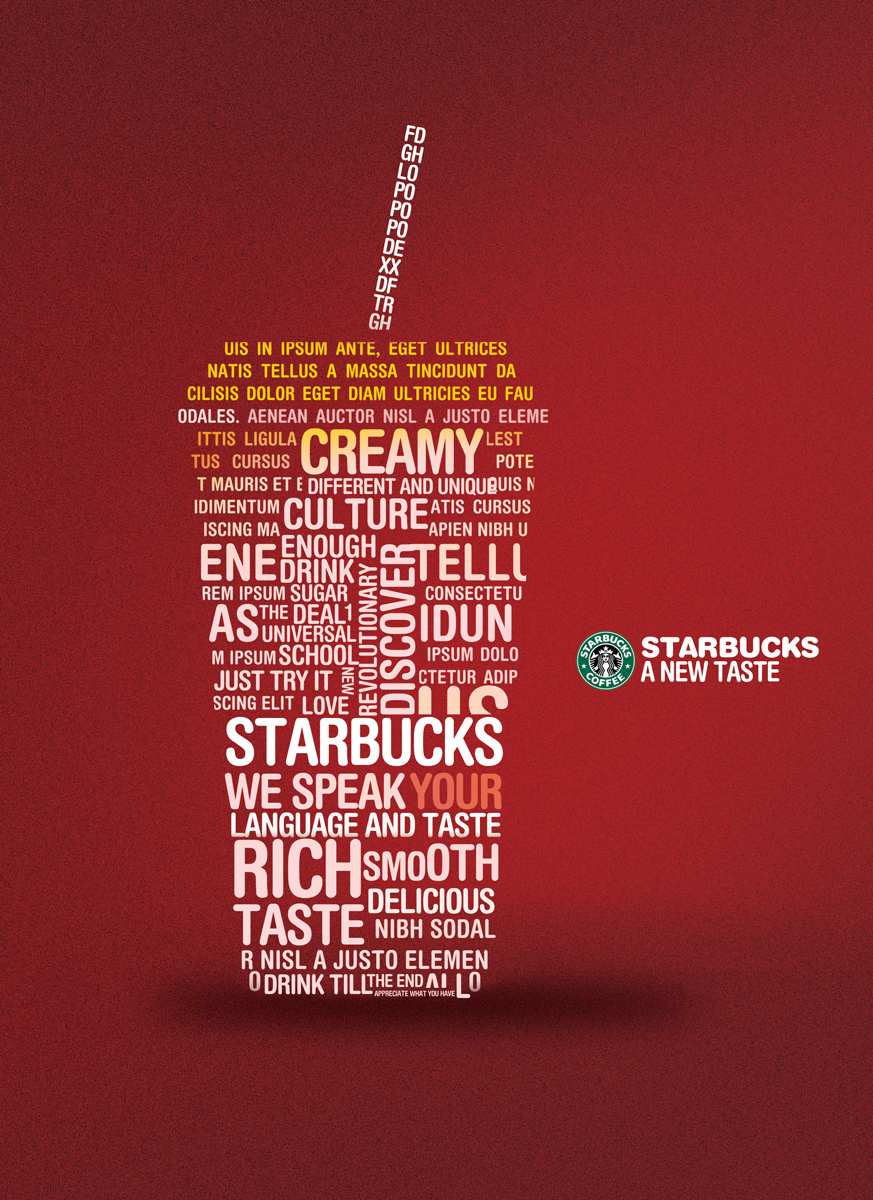
Other typography I like:


I noticed that black and white fonts/logos were very popular:


No comments:
Post a Comment