Hi I'm Megan Selby and this is my digital media blog.
I will be posting ideas and inspirations about graphic design and what has inspired me.
Monday, 13 April 2015
60's Influences
After being so inspired by Saul Bass I loved the idea of having a 60's element in my work.


As the camera is the center piece of my poster and my logo, I thought I would use a camera from the 60's and trace it on illustrator. I looked at a few different styles and selected the one I thought was the best.
The modern camera's just wouldn't have looked like cameras if they had been sketched as they are so small and don't have the universal features anymore that people identify with classic cameras.
Modern:


More distinct dated cameras 1960:


The significance of typography
When getting a greater understanding of graphic design throughout the weeks I started to learn how significant typography was in graphic design.
This revelation began when in week 2 when we watched the helvetica documentary which I found very interesting. I didn't realize that helvetica was everywhere!


As I learnt more about helvetica and its significance it made me think about other typefaces and their importance.
When I was choosing my typeface I wanted it to really stand out.
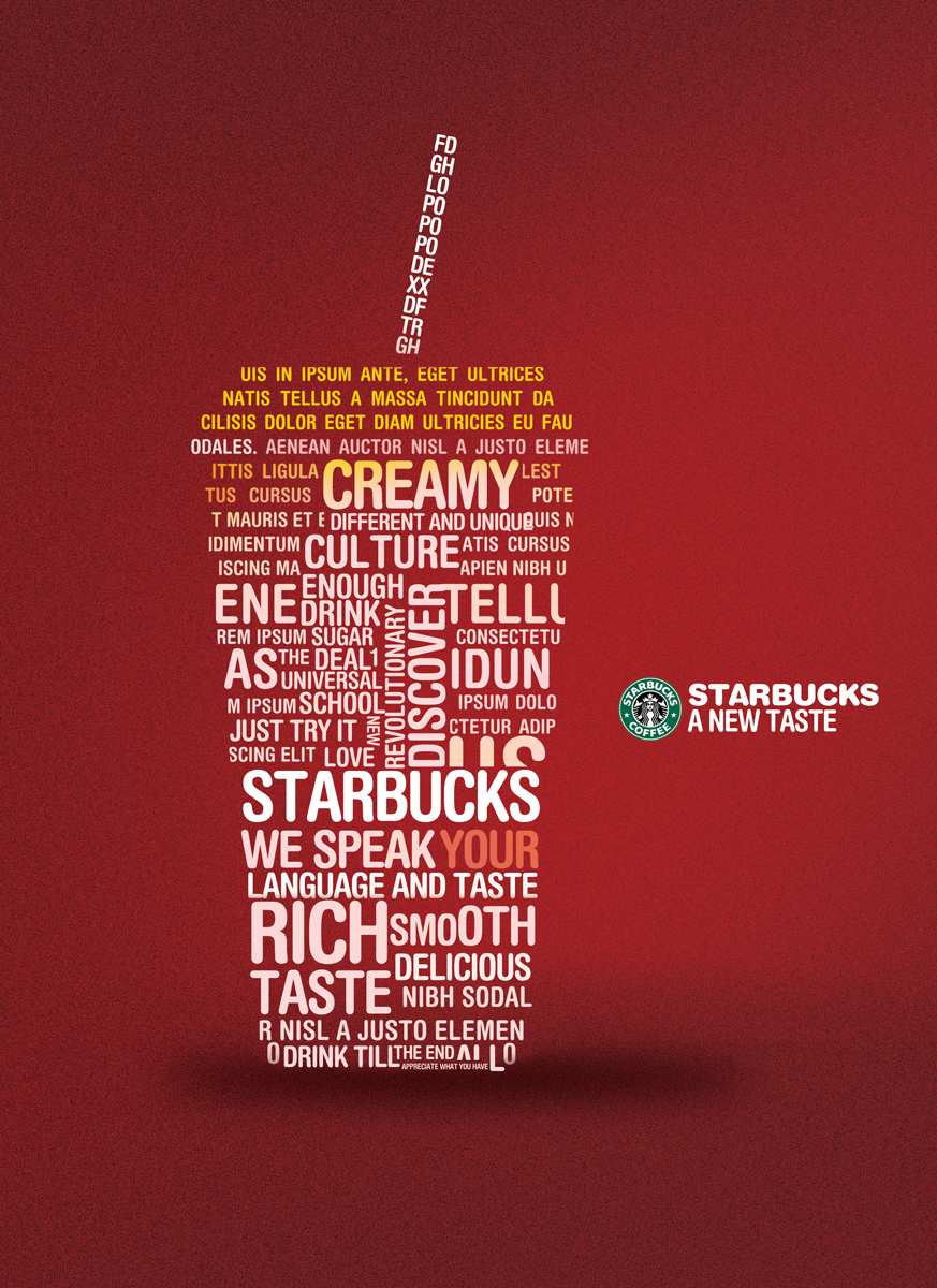
Other typography I like:


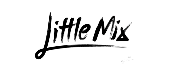
I noticed that black and white fonts/logos were very popular:


This revelation began when in week 2 when we watched the helvetica documentary which I found very interesting. I didn't realize that helvetica was everywhere!


Helvetica is such a timeless font, its simplistic and is standing the test of time. You cant go wrong with Helvetica.
As I learnt more about helvetica and its significance it made me think about other typefaces and their importance.
When I was choosing my typeface I wanted it to really stand out.
Other typography I like:


I noticed that black and white fonts/logos were very popular:


Subscribe to:
Comments (Atom)

